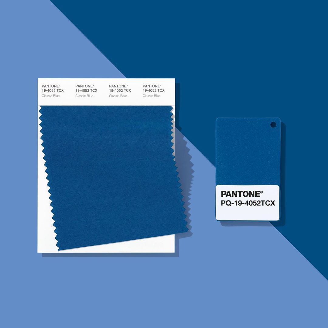
An announcement eagerly awaited by interior lovers and fashion houses alike, the Pantone Colour of the Year provides an insight into a whole year's worth of trends, giving us a suggestion of the tones we should be adopting in our homes and wardrobes. Carefully selected, Pantone use global trend forecasts, colour psychology and colour consulting to decide on their colour of the year and define the power and emotions behind it. This year they decided on PANTONE 19-4052 Classic Blue, an elegant, timeless primary colour to ease us into the new decade. With insight from our homeware buyers, here's how you can welcome the Pantone Colour of the Year into your home.
#1 What is the Pantone Colour of the Year?
As we enter a new decade, Pantone has decided on a colour that's both grounding and empowering. As a bold primary hue, their choice of Classic Blue is a reliable, enduring colour that is timelessly known and loved, giving us a sense of stability and assurance when we look at it. However, being such a striking tone, Classic Blue also provides us with feelings of confidence and power. Making it the perfect colour for your entire home, Classic Blue conjures feelings of
Calm
Confidence
Connection
Dependability
Power
Joy
According to Leatrice Eiseman, the Executive Director of the Pantone Colour Institute, the colour is evocative of 'the vast and infinite evening sky', encouraging us to challenge ourselves while also helping us feel calm and grounded.
#2 How should I style the Pantone Colour of the Year in my home?
Kitchen
As the Pantone Colour of the Year ignites our confidence, it's time to ditch boring black pots and pans for a Classic Blue alternative. Le Creuset's range in Marseille Blue is a perfect way to adopt the colour, pairing the timeless colour with their iconic signature stoneware and cast iron kitchen essentials. Maybe the confidence and empowerment of the colour will rub off on your cooking skills as you serve up dishes with a side of style.
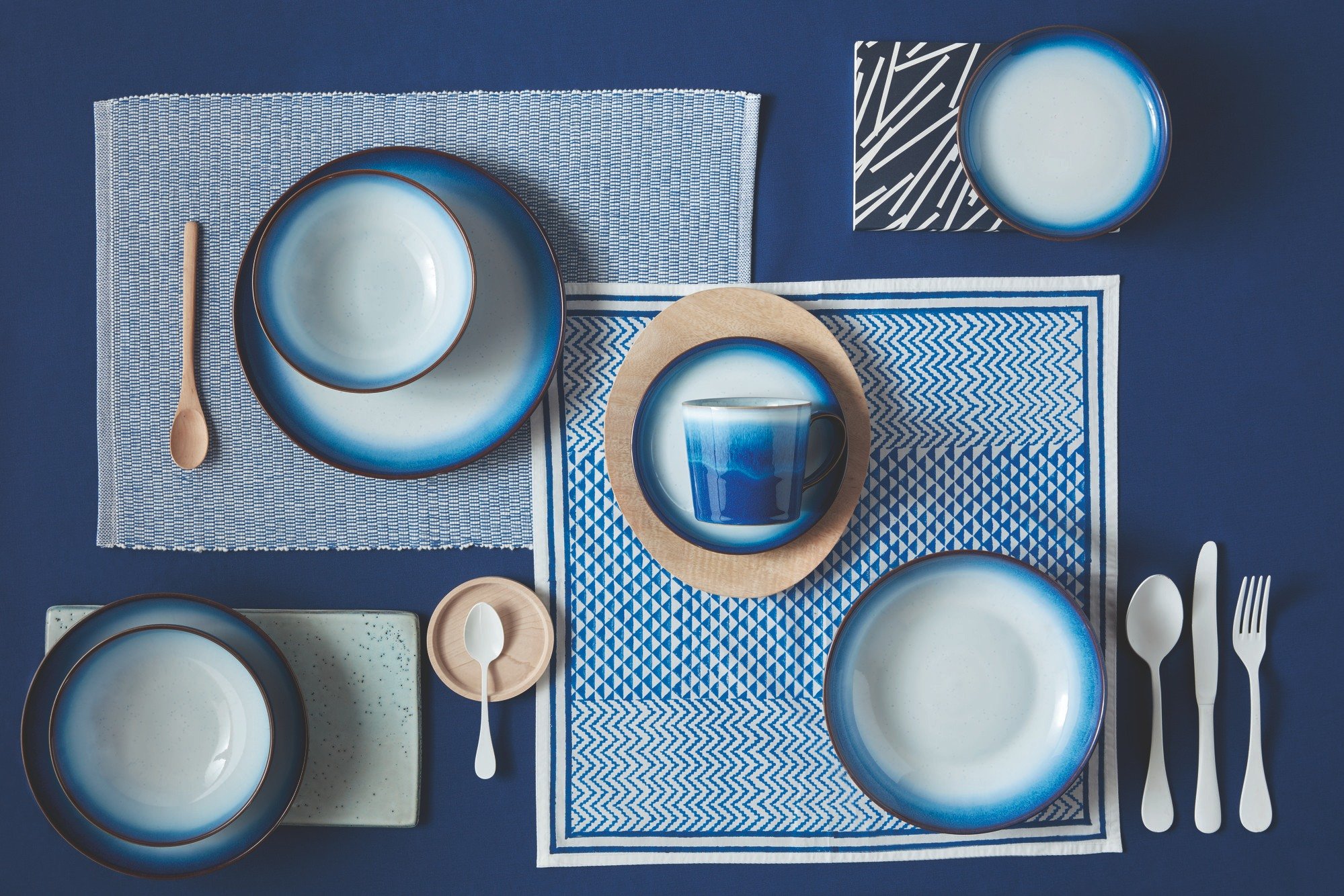
With minimal changes or effort, you can create a beautiful trending table, adding pops of Classic Blue into your kitchen. From Denby plates to LSA glasses, tableware is a great way to refresh your kitchen interior without touching a drop of paint. When it comes to laying the table, if you have lighter wood or white features, we'd pair Classic Blue with white and grey tones for a homely, calming atmosphere. But for darker tones, up the drama with pops of metal, adding in touches of silver and gold through your cutlery choice and candle holders.
Living room
In your living space, it's all in the details. You may not be ready to splash out on a Classic Blue sofa or paint the walls with the Pantone Colour of the Year, but you can still bring the tone into your room through pops of colour and little features.
The obvious option is soft furnishings. If your sofa colour will allow, try adding some Classic Blue pillows in luxurious textures like velvet to add a touch of art deco influence or a multi-tonal cushion with earthy tones for a more grounding atmosphere. You could also throw in a blanket or a rug to tie the colour into the room fully.
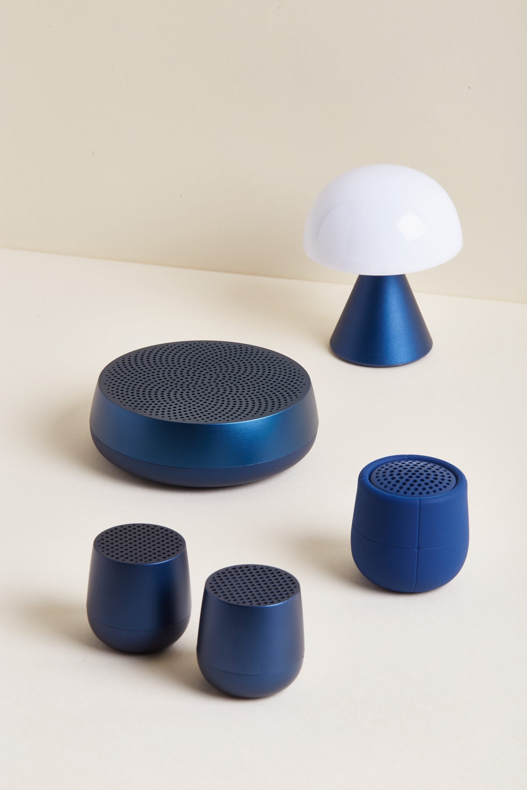
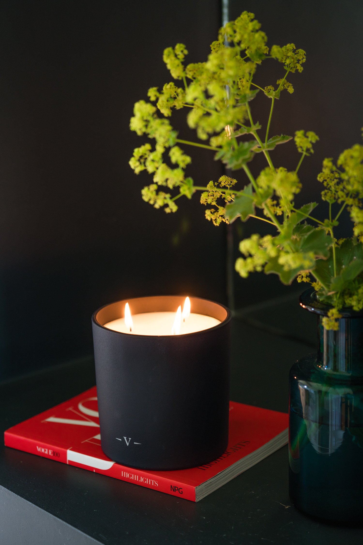
For an alternative, create an area in the room for the Pantone Colour of the Year to really have a moment. Try adding a pop of blue onto each shelf of bookshelf or on your sidepiece for a feature area for the colour. Whether it be candles, a speaker or even cleverly chosen books, adding this year's colour into your room is much easier than you think, all coming down to thoughtful arrangement. You could even simply just swap out your cafetiere and mugs to a Classic Blue set to impress your guests and add a little piece of the trend into your 2 pm tea.
Bathroom
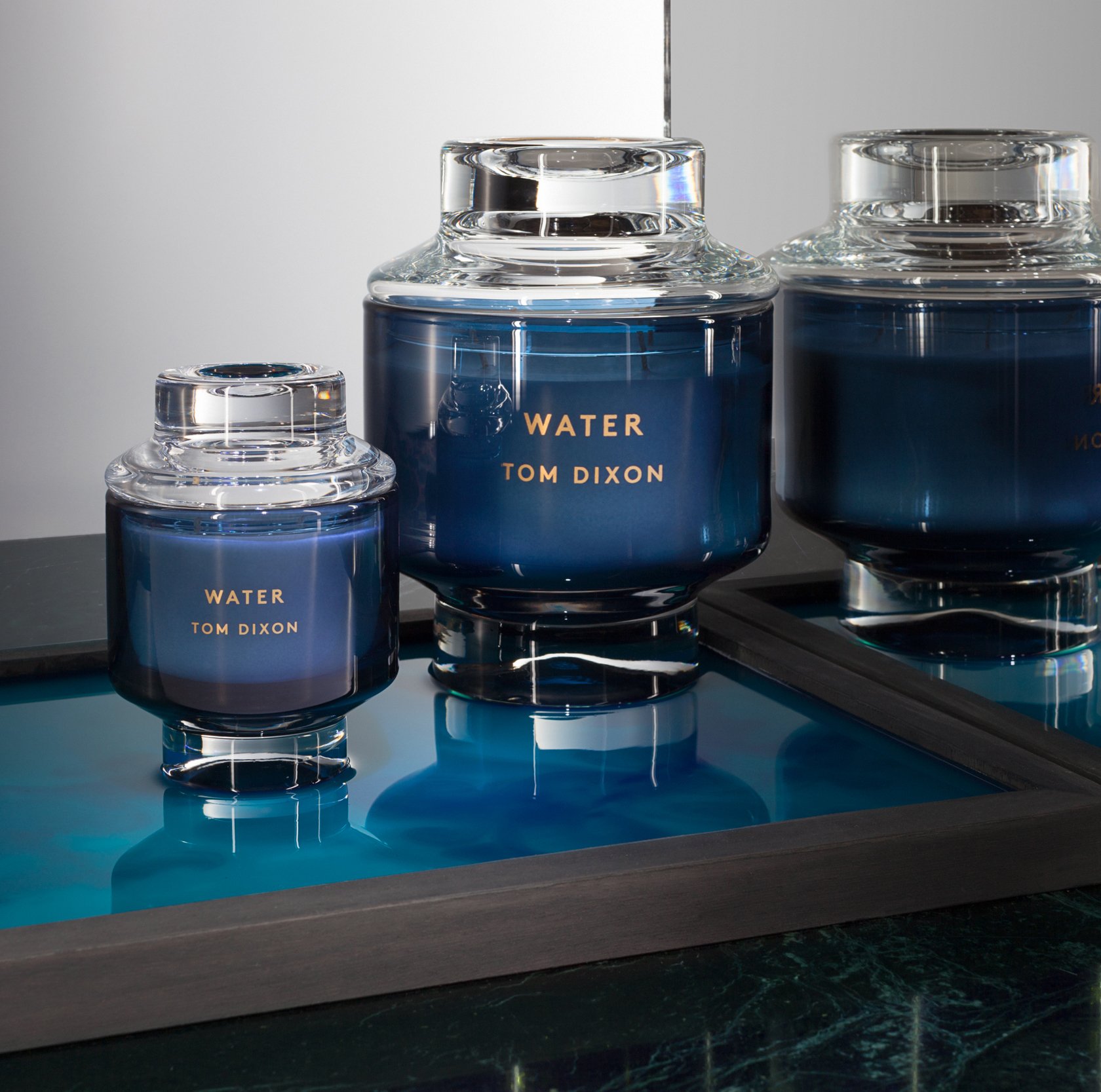
Blue for a bathroom is an obvious option. Calming and aquatic, it may feel too cliche but the depth of Classic Blue adds a fresh take. Leaving out any green or turquoise undertones, the Pantone Colour of the Year is a far fresher, richer option leaving the cliche behind in favour of a more mature and refined palette.
It couldn't be easier. Simply swap out your white towels for Classic Blue ones, treat yourself to a new reed diffuser or candles for those nights spent soaking in the tub, even seek out a blue hand soap to create a Pantone approved theme. Whether you go for a neutral earthy theme with additions of white and grey, or a lux art deco atmosphere with dark gold features, the Pantone Colour of the Year will elevate your interior for the new decade.
Bedroom
When adding the Pantone Colour of the Year into your bedroom, you have two paths to go down; calm or confident.
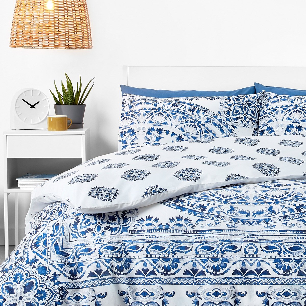
For a calming, soothing room opt for earthy tones that will soften the bold Classic Blue. Choose a bedding set that features the blue along with other shades to lighten the dark tone, then think about adding in some lighter textured pieces. Nkuku have some great options, from wicker lampshades to wood and glass vases, ready to add a softness to the room. Think Grecian island, looking towards copper tones, greys, whites and lighter blues.
Alternatively, stay decadent and highlight the deep, rich quality of the colour. Encouraging feelings of confidence, dress your room into a rich, 1920's boudoir which art deco inspired additions and gold features. Keep your bed plush and bright like a 5-star hotel, but choose a Classic Blue fitted sheet and add throw pillows in blue and other jewel tones. With the addition of a vintage-inspired mirror, decadent candles and luxurious textures, the Pantone Colour of the Year will make your bedroom feel like it belongs in Gatsby's mansion.
Written by Lucy Harbron